...
| Table of Contents | ||||||||
|---|---|---|---|---|---|---|---|---|
|
1. Templates
Please remember to recognize your research project sponsor on all public communications.
1.1 PowerPoint Presentations
- Standard CTR-Branded PowerPoint Presentation Template (4:3 aspect ratio. Requires Microsoft PowerPoint, .potx)
- Widescreen CTR-Branded PowerPoint Presentation template (16:9 aspect ratio. Requires Microsoft PowerPoint, .potx)
1.2 Conference Posters
Use of CTR-branded poster templates are highly encourage. These templates are required for the annual CTR Symposium, where all posters must conform to the 72" x 36" size. Projects supported through CTR must include CTR branding. Poster header may be adjusted to use FSEL, UTC, or other wordmarks or logos.
- CTR-Branded Poster Template for MS Publisher (.pub, 72″ x 36″ banner size.)
- CTR-Branded Poster Template for MS PowerPoint (.pptx, printing at 200% = 72″ x 36″ banner size.)

1.3 Handouts
- CTR-branded Word document (Requires Microsoft Word, .docx)
- CTR letterhead.docx
1.4 Email Signature
To maximize the effectiveness and consistently of the CTR brand, it is highly encouraged that all CTR staff members use a standardized format for email signatures. The CTR email signature will be the UT Austin signature, with the CTR logo placed immediately below as a .jpeg image file.
...
- UT Burnt Orange and Gray are used for the email signature. Please see Primary Color Palette.
- Type Family: Arial
- Name: BOLD ALL CAPS UT in Burnt Orange
- Divide sections with a “|” (a.k.a. pipe mark) on your keyboard. Use two spaces before and after. [SHIFT] +[ \ ] = |
2. Primary Color Palettes
How Do I Use This Color Palette?
The Primary Color Palette should be used for all marketing materials, presentations and corporate brochures. Each color serves a specific purpose as described below:
...
| Warning |
|---|
For accessibility purposes, if including text with these colors, make sure that there is sufficient contrast between the background and text to meet WCAG 2.0 Level AA requirements. Recommended tools are WebAIM's online Color Contrast Checker or Paciello Group's downloadable Colour Contrast Analyser. |
What Do These Values Mean?
PMS and CMYK (4C) values are used for four-color process or spot color printing. HTML colors are used in Web design. RGB values can be used to create custom colors in most Microsoft Office applications, such as Word and PowerPoint. Please do not tint any of the primary colors.
2.1 Primary Colors
Dark Gray
Background Color color #454545 -------------------------- PMS (C): 75% BLACK
CMYK (4C): 0, 0, 0, 75
RGB: 69, 69, 69
HTML: #454545Bright Blue
Background Color color #00A4D9 --------------------
PMS (C): 639
CMYK (4C): 100, 1, 5, 5
RGB: 0, 164, 217
HTML: #00A4D9Burnt Orange
Background Color color #BF5700 ------------------- PMS (C): 159
CMYK (4C): 0.00, 0.54, 1.00, 0.25
RGB: 191, 87, 0
HTML: #BF5700
2.2 Secondary Color Palettes
The Secondary Color Palette should only be used as accent colors that appear in charts, graphs, icons and illustrations. Tints of up to 50% may also be applied to each color. These colors should not be used for large blocks of color, headlines or body copy.
Light Gray
Background Color color #EFEFF0 ---------------------- PMS (C): COOL GRAY 1
CMYK (4C): 3, 2, 4, 5
RGB: 239, 239, 240
HTML: #EFEFF0Dark Blue
Background Color color #002C5F ---------------------- PMS (C): 654
CMYK (4C): 100, 73, 10, 48
RGB: 0, 44, 95
HTML: #002C5FGreen
Background Color color #007B69 --------------------- PMS (C): 3295
CMYK (4C): 100, 5, 51, 23
RGB: 0, 123, 105
HTML: #007B69Purple
Background Color color #6E267B ------------------- PMS (C): 259
CMYK (4C): 69, 100, 1, 5
RGB: 110, 38, 123
HTML: #6E267BYellow
Background Color color #F0AB00 -------------- PMS (C): 130
CMYK (4C): 0, 30, 100, 0
RGB: 240, 171, 0
HTML: #F0AB00
3. Typography
To maintain a consistent visual identity, Clear Sans has been selected for marketing materials.
In marketing materials, use Clear Sans Light in special instances where the headline font size is larger than 30 pt.

Clear Sans Regular has been selected as our official font for body copy, intro paragraphs & subheads appearing in marketing materials.

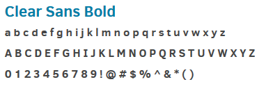
In marketing materials, use Clear Sans Bold if a word or phrase needs to be bolded or for type that’s 6 pt or smaller. Please use this font weight sparingly.
General Applications of Each Font Weight that Should be Used Throughout the Marketing Collateral
![]()
4. Logo Usage
The CTR Logo is primarily a two color Logo comprised of both a mark, as well as type. There are five color choices for the Logo: color, grayscale, black & white and reversed on a solid background.
It is crucial to maintain the Logo’s integrity, which is why the following guidelines have been established. By following these guidelines you will maintain the brand’s identity and the Logo’s full visual impact. The Logo should not be altered in any way; however, in certain instances the mark may fall into one of the alternative CTR logo categories discussed further in this section.
4.1 Primary CTR Logo
4.1.1 Spot Color

Always used on a white or light neutral background for maximum impact and clarity. Use this logo when printing offset with spot colors or in other printing
situations where spot colors are being used.
4.1.2 Process Color

Always used on a white or light neutral background for maximum impact and clarity. Use this version for all CMYK process printing situations, such as printing from your laser printer or for a publication who will print your advertisement in CMYK.
4.1.3 Grayscale

Should be used for better legibility and clarity in a black and white setting. Example applications: black and white newspaper ad, sponsor poster, etc.
4.1.4 Black & White

Should be used sparingly and is reserved for promotional materials only. Example applications: embroidery on shirts, pens, etc.
4.1.5 Reverse

Should be used in black & white applications with dark backgrounds. Example applications: pens, USB sticks, polo shirts, etc.
4.2 Logo File Types, Clearspace & Size Usage
4.2.1 Logo File Types
Below are the file usage instructions for the different file types provided to you.
- EPS files are used when printing in color with spot or process inks and are highly scalable making them the most versatile of all the file formats. They also work well for oversized signage and banners.
- JPGs can be used in on-screen applications where a solid white background included behind the Logo won’t be an issue.
- Websafe PNGs are used in on-screen applications when a transparent background is required, such as websites, PowerPoint, Word, online banner ads, etc.
- Bitmap files should only be used if requested by a vendor. For example, sometimes vendors use BMP files when embroidering Logos on hats or t-shirts.
4.2.2 Clearspace

The Logo should always have white space surrounding it. This will give the Logo more presence on the page. Always leave space equal to the width and height of the “C” in the CTR mark. This is known as the “C” of the Logo.
4.2.3 Size Usage

When the Logo is reduced, there is a point at which it becomes ineffective. Establishing a minimum size for the Logo ensures the Logo is always prominent and readable. The CTR Logo should never be reproduced smaller than 1″ across.
4.3 Alternative CTR Logos
4.3.1 Tagline Logo

The Tagline Logo can be used when the brand wishes to promote CTR’s tagline “Collaborate. Innovate. Educate” instead of promoting the CTR name. The spot versus process, clearspace and size usage rules are also applicable with this instance of the Logo.
4.3.2 CTR + UT Wordmark Logo

In certain situations CTR might want to promote their association with The University of Texas at Austin. If this is the case, the Logo that contains the “Center for Transportation Research” type along with the UT Wordmark can be used. The spot versus process, clearspace and size usage rules are also applicable with this instance of the Logo.
4.3.3 Stand Alone Mark

In certain situations the mark may be disconnected from the “Center for Transportation Research” type and used as a glyph, but it may not be modified in any way. The disassociation between mark and logotype should only occur when the Logo appears in its entirety somewhere else on the page or screen.
4.4 Center Logos
4.4.1 D-Stop Center Logo
![]()
![]()
Use this logo when promoting the D-Stop Center. Never use the Logo in conjunction with the CTR Logo, but rather in place of it. A two color and one color version of this logo can be used where applicable. The spot versus process, clearspace and size usage rules are also applicable with this Logo.
4.4.2 Network Modeling Center Logo
![]()
![]()
Use this logo when promoting the Network Modeling Center. Never use the Logo in conjunction with the CTR Logo, but rather in place of it. A two color and one color version of this logo can be used where applicable. The spot versus process, clearspace and size usage rules are also applicable with this Logo.
4.5 Logo Don’ts

Modification
The Logo and its alternate versions should not be modified in any way. This includes, but is not limited to: stretching, recolorizing, rotating, retypesetting, altering the proportions, moving elements, flipping elements and placing the Logo on a low contrast background.
5. Iconography
![]()
Icons should provide at-a-glance comprehension with little distractions and should always have a similar illustration style to the examples at right. They should be relevant to the topic at hand and relate to transportation, research or education in some way.
...