We follow UGS design standards on every piece that represents the school to an audience outside of UGS staff. Using a defined look and feel helps us present a consistent and easily identifiable “face” to the university, prospective students, current students, and parents. This includes using only the approved font combinations, color palette, and appropriate logos.
Overall Look & Feel
- Photos that focus on faces and expressions are in nearly every design. Use candid portrait-style closeups and photos that show animated interactions. Confused about digital photos? Here's a breakdown.
- Solid color blocks in the UGS palette anchor photos and white space
- Transparent color blocks over larger photos make text legible
- Large display text sits just above and just below photo edges
- Backgrounds are either flat white on larger pieces or a photo with bleed edges on smaller pieces
- Word counts are kept to a minimum
Go to our Gallery of Sample Designs to see some examples of previous collateral.
Templates and Logos
You can download templates for PowerPoint and MicrosoftWord from here.
You can download your program/UGS logo from here.
You can download a summary of the logo guidelines here. The complete UGS/UT brand guidelines for logo usage can be downloaded here.
Use of Compass in Designs
You can use the compass image as a spirit mark in your designs as we transition to the new UT logo system. Often times this will mean using it as a watermark or partial background image.

Do not use the compass to replace a letter or part of one.
The compass should always be secondary to the college, school, unit (CSU) or student group logo/words. As a secondary mark, the compass may not be the focus of the piece. Its placement must be in a less prominent location than the primary logo or message.
Color Palette
All materials that you produce should only use colors from the palette below. Use the colors below, from the Pantone (PMS) Solid Coated palette.
Primary colors should be used as main or accent colors, and secondary colors are neutrals chosen to match well with our primary palette and to fill up “white space” in designs.

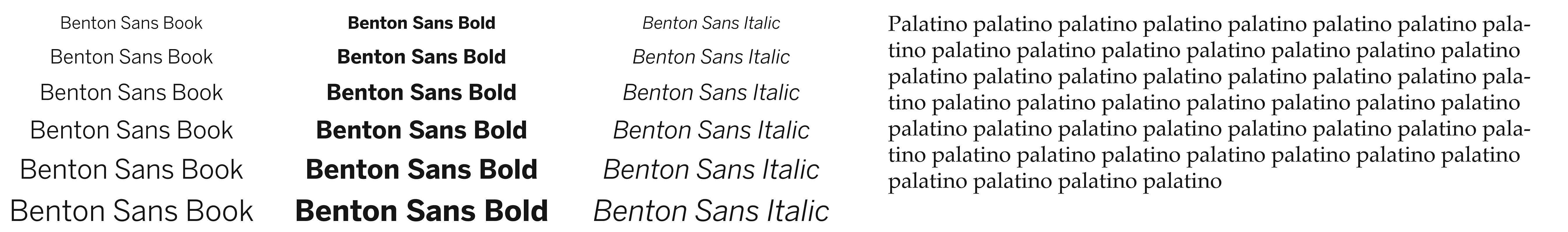
Fonts
For titles, use Benton Sans. If you would like us to purchase Benton Sans for your program, please contact your communications representative.
For body copy, use Palatino (for longer documents, with a lot of text) or Benton Sans (for shorter documents, with not much text).