It is important to make sure that your documents are accessible to as many people as possible. For FHWA and other publications funded through the U.S.Government, Section 508 compliance is required. In addition, there are an increasing number of lawsuits being filed against entities that post documents that are not accessible.
For tutorials, checklists, and guidelines, see https://www.section508.gov/content/build/create-accessible-documents.

Tips
- Use the accessibility tools built into MS Office and other products that you use to create documents.
- "Print to PDF" will strip out all accessibility tags previously added in MS Office applications; instead, use "Export" or "Save As PDF" when converting your document.
- Graphics must include alt text that screen readers can use to describe the content.
- Color contrast between background and text must be compliant to WCAG 2.0 Level AA standards, at a minimum. See A11y Color Palette, WebAIM Contrast Checker, Paciello Group's Colour Contrast Analyser.
Graphs
Make sure that graphs and other images do not rely solely on color to convey information. If necessary, use online tools such as Coblis or Sim Daltonism to test your images.
- This graph cannot be interpreted by somebody with Monochromacy / Achromatopsia, nor when printed in grayscale.

- This graph uses shapes in addition to color to convey the information. It can be interpreted in grayscale and by somebody with Monochromacy / Achromatopsia.


Bar Charts
Even if you are color coding, make sure values or labels are included with each bar for screen readers. If the color differences are significant to understanding the chart, make sure that they have sufficient color contrast and difference in darkness for a colorblind user to interpret.
Example 1. The below bar chart includes labels on each bar. Color contrast needs to be checked to make sure that there is enough contrast between the white text (foreground) and the red, orange, blue, and gray bars (background). In addition, if the bar colors are significant and correspond with a key, then the contrast between each bar color also needs to be checked.
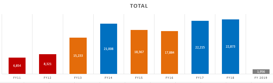
- Checked on the Coblis free online colorblindness simulator. In this case, for readers with monochromacy, there is little to no difference between the orange and the gray bars. The difference between the red and the blue bars could also be easily confused.

To check the foreground (text) against the background (bar), check the color codes on WebAIM's Contrast Checker or other tool.

TIP
To test color contrast, you need the exact value for each color used. If testing colors that are on a website, try a color picker browser add-on to find this value. For desktop applications, free software such as Paciello Group's free Colour Contrast Analyser may help.