We follow UGS design standards on every piece of material that represents Undergraduate Studies to an audience outside of UGS staff. This includes using only the approved font combinations, color palette, and appropriate logos on every printed or emailed item that comes out of your office. Templates for Word, InDesign, and Powerpoint are also available for your use. InDesign templates require some previous design background.
Overall Look & Feel
To tie everything that we do together, we use a few visual elements in all of our print and web pieces.
- We use photos in nearly every design, sticking with those that focus on faces and expressions. We like candid portrait-style closeups and photos that show animated interactions between students and students or students and professors.
- Solid color blocks in our palette (see below) anchor photos
- Transparent color blocks placed over larger photos allow us to make small text laid over photos more legible
- Large display text lies just above and just below photo edges
- Backgrounds are either flat white on larger pieces or a photo with bleed edges on smaller pieces. If flat white is used, one edge should be bordered with a solid or transparent color block.
Click on the thumbnails to see larger samples of our print pieces.
|
5x7" UGS promotional postcard. |
|
11x17" Research Week poster |
|
6x4" FIG postcard |
|
11.75x21'' FIG tabletop banner |
|
3.6x8.5" trifold flag brochure (dimensions when brochure is folded) |


Color Palette
Using a defined palette helps us present a consistent and easily identifiable “face” to the university, prospective students, current students, and parents. All material that you and your office produce should use colors only from the palette below. Use the PMS numbers below to choose your colors for print, and the hex numbers for web.
Some of the colors in our palette are associated with specific programs, but any program in Undergraduate Studies is welcome to use any of the colors below. Primary colors should be used as main or accent colors, and secondary colors are neutrals chosen to match well with our primary palette and to fill up “white space” in designs.

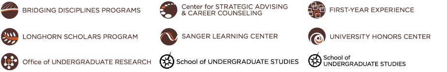
Logos
The School of Undergraduate Studies logo and UT Austin word mark must be included on all materials. Program logos can be used as appropriate. You must use the circle and text of the logo together as a single logo.
- Do not separate the text from the circle
- Do not use just the words or just the circle part of the logo
- Do not change the size proportions of one part of the logo (i.e. resize the circle without resizing the text the same amount)
- Do not move the circle and the text closer together or further apart
Fonts
We use Gotham for titles. Gill Sans regular is the alternative for titles only if you do not have Gotham.
For body copy, we use Palatino for print or screen and/or Gotham book.
Here is a great introduction to typography. And a good primer on typeface combinations is here. If you do not have an installed copy of Gotham, please contact the UGS communications team.
