Once we've gotten gene counts, log fold changes and P Values, we can generate different plots in the R environment for data exploration. Remember that for most plots, you need your gene count data to be log transformed.
WHY? This is explained well here.
"Many of these plotting tools work best for data where the variance is approximately the same across different mean values, i.e., the data is homoskedastic. With raw read count data, variance grows with the mean. So, we will be biased towards the few highly expressed genes that show the largest variance. To avoid this, we typically take the logarithm of the normalized count values plus a small pseudocount; however, now the genes with the very lowest counts will tend to dominate the results because, due to the strong Poisson noise inherent to small count values, and the fact that the logarithm amplifies differences for the smallest values, these low count genes will show the strongest relative differences between samples.
As a solution, DESeq2 offers transformations for count data that stabilize the variance across the mean.- the regularized-logarithm transformation or rlog (Love, Huber, and Anders 2014). For genes with high counts, the rlog transformation will give similar result to the ordinary log2 transformation of normalized counts. For genes with lower counts, however, the values are shrunken towards the genes’ averages across all samples. Using an empirical Bayesian prior on inter-sample differences in the form of a ridge penalty, the rlog-transformed data then becomes approximatelyhomoskedastic, and can be used directly for computing distances between samples and making PCA plots. "
The Data
We are looking at real data from a time point experiment. We have 6 samples across:
- 2 different time points
- 2 different conditions: control vs treated
- 2 replicates each.
We've already run DESEQ2 likelihood ratio test on this dataset to normalize the data, and identify differential expression. Now, we are going to make sure everything looks right some exploratory and visualization tools.
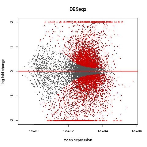
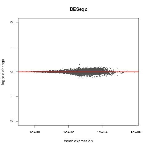
We saw something odd when we ran two paired t tests on this data (using DESEQ2 again)- on 3 hour data seperately and 6 hour data seperately. So, we need to investigate further.
MA PLOT FOR 3 HOUR DATA
MA PLOT FOR 6 HOUR DATA
Understanding the Plots:
Heatmap:
A heatmap is a way to represent a matrix of data (in our case, gene expression values) as colors. The columns of the heatmap are usually the samples and the rows are genes. It gives us an easy visual of how gene expression is changing across samples. While it can be plotted using all genes, it usually makes more sense to plot it using a set of highly varying genes.
On a heatmap, you can also add a dendogram which clusters the columns (samples) based on expression of the selected set of genes and/or a dendogram which clusters the rows (genes) based on the expression of those genes. Clustering the samples tells us about which samples group together based purely on gene expression; clustering the genes identifies groups of genes that are coexpressed in our conditions. If you have a large gene set, be aware that clustering the rows may take a little while.
PCA:
PCA is a dimensionality reduction transformation. It lets you visualize how the data groups based on a few principal components or dimensions that explain the highest variability.
If we are plotting this in a 2 dimensional plot, it makes sense to view the two components (PC1, PC2) that explain the most variance. If we view it in 3 dimensional space, we can look at the top three principal components and so forth.

#MAKE SURE YOU ARE IN THE RIGHT DIRECTORY
cds
cd my_rnaseq_course/day_3_partA/gene_expression_exercise/visualizations2

#MAKE SURE YOU ARE IN THE IDEV SESSION. YOU WILL KNOW YOU ARE IN AN IDEV SESSION BECAUSE YOUR PROMPT WILL HAVE A COMPUTE NODE NAME LIKE #C0124... OR YOU CAN TYPE HOSTNAME TO SEE THAT THE HOST NODE WILL HAVE A NAME LIKE #C0124...
#IF YOU DON'T HAVE ONE, REQUEST ONE BY USING ONE OF THESE COMMANDS:
idev -m 60 -q normal -A UT-2015-05-18 -r RNASeq-Wed
idev -m 60 -q normal -A UT-2015-05-18
module load biocontainers
module load r-empiricalfdr.deseq2/ctr-1.0.3--r3.3.2_0
#Within R
#load libraries
library("DESeq2")
library("RColorBrewer")
library( "genefilter" )

#I've already run DESEQ2 on this experiment for you. Just load the results
load("deseq2.kallisto.RData")

#Regularized log transformation
rld <- rlog( dds, fitType='mean', blind=TRUE)

#Get 25 top varying genes
topVarGenes <- head( order( rowVars( assay(rld) ), decreasing=TRUE ), 25)

#make a subset of the log transformed counts for just the top 25 varying genes
top25Counts<-assay(rld)[topVarGenes,]
write.csv(top25Counts, file="top25counts.rld.csv", quote=FALSE)

#PLOT PCA
#INCLUDE NEXT LINE IF YOU WANT TO SAVE THE FIGURE IN A FILE
pdf(file="pca.pdf")
#PCA using top 500 varying genes
print(plotPCA(rld, intgroup=c("condition"), ntop=500))
#INCLUDE NEXT LINE IF YOU WANT TO SAVE THE FIGURE IN A FILE
dev.off()
q()
The above code snippet is already in a R script called visualizations.R. Alternatively, just run this.
R CMD BATCH visualizations.R
module load r-pheatmap/ctr-1.0.8--r3.3.2_0
#Within R
#load libraries
library("pheatmap")

#Read in the regularized log transformed counts for the top 25 varying genes
top25Counts<-read.table("top25counts.rld.csv", sep=",",header=TRUE, row.names=1)

#PLOT HEATMAP USING PHEATMAP
#INCLUDE NEXT LINE IF YOU WANT TO SAVE THE FIGURE IN A FILE
pdf(file="gene.heatmap.pdf")
#heatmap using top 25 varying genes
pheatmap(top25Counts,scale = "row")
#INCLUDE NEXT LINE IF YOU WANT TO SAVE THE FIGURE IN A FILE
dev.off()
q()
The above code snippet is already in a R script called pheatmap.R. Alternatively, just run this.
R CMD BATCH pheatmap.R
What do these graphs tell us? Are there any apparent issues with the data?
#Transferring files from stampede2
On your computer's side:
Go to the directory where you want to copy files to.


scp my_user_name@stampede2.tacc.utexas.edu:/home/.../stuff.fastq ./


Replace the "/home/..." with the "pwd" information obtained earlier.
This command would transfer "stuff.fastq" from the specified directory on stampede2 to your current directory on your computer.
We can make even more sophisticated heat maps with pheatmap using more sample metadata information.

There are also other R PCA functions. Here is a PCA R script that was written by a bioinformatician in the group. The first two lines tell you about the inputs to the pca script.
More DESeq2 help here:https://www.bioconductor.org/packages/devel/bioc/vignettes/DESeq2/inst/doc/DESeq2.html
Back to COURSE OUTLINE