CURRENTLY UNDER CONSTRUCTION
Information on this page is based on a Windows PC with Adobe Photoshop version 23.0 (and later), Adobe Illustrator version 26.0 (and later), and GraphPad Prism 9. Also requires basic knowledge of Microsoft Excel, Microsoft PowerPoint, Reconstruct, and maybe Fiji/ImageJ. This page is intended as an introduction to a workflow for preparing figures for peer-reviewed publication, and is not to be a comprehensive guide to features/tools available on these software. You should consult elsewhere if you need/want to learn more about specific features, and add what you learned to this wiki.
Read and understand "Information for Authors" for your intended Journal
Every journal has its own figure format, so pay attention to what they are asking for. Not following the instructions can result in published figures with a sub-optimal resolution, shifted colors, shifted brightness/contrast, etc., etc. You've worked so hard to get to a point where you are ready to publish your interesting data, right? So let's make sure to show your data to the world in the best way possible!
In general, most journals will have specific requirements for the following: file format, figure dimensions, color mode and resolution, use of colors, figure annotations.
So let's start by looking at an example and figure out what they are talking about. Below is a set of instructions for figures to be published in one of our favorite journals, Journal of Neuroscience (Information as of Dec. 2021; bold by MK).
Figures Figures must be numbered independently of tables, multimedia, and 3D models and cited in the text. Do not duplicate data by presenting it both in the text and in a figure. A title should be part of the legend and not lettered onto the figure. A legend must be included in the manuscript document after the reference list, and should include enough detail to be intelligible without reference to the text. Figures must be submitted as separate files in TIFF or EPS format and be submitted at the size they are to appear: 1 column (maximum width 8.5 cm), 1.5 columns (maximum width 11.6 cm) or 2 columns (maximum width 17.6 cm). They should be the smallest size that will convey the essential scientific information. Illustrations should be prepared so that they are accessible to our many color-blind readers, so color should only be used if it is necessary to accurately convey the information being presented by the image. Grayscale generally provides a more faithful representation when a single quantity is displayed. Use textures or different line types rather than colors in bar plots or graphs. Figures with red and green are particularly problematic, and should generally be converted to magenta and green. If no suitable combination can be found, consider presenting separate monochrome images for the different color channels. For line drawings that require color, consider redundant coding by adding different textures or line types to the colors. Color figures should be in RGB format and supplied at a minimum of 300 dpi. Monochrome (bitmap) images must be supplied at 1200 dpi. (← MK note: they are talking about graphs and line drawings in raster file format here.) Grayscale must be supplied at a minimum of 300 dpi. For figures in vector-based format, all fonts should be converted to outlines and saved as EPS files to ensure that they are reproduced correctly. Remove top and right borderlines that to not contain measuring metrics from all graph/histogram figure panels (i.e., do not box the panels in). Do not include any two-bar graphs/histograms; instead state those values in the text. All illustrations documenting results must include a bar to indicate the scale. All labels used in a figure should be explained in the legend. The migration of protein molecular weight size markers or nucleic acid size markers must be indicated and labeled appropriately (e.g., “kD”, “nt”, “bp”) on all figure panels showing gel electrophoresis." |
So what does JNeurosci ask for?
| File format | TIFF or EPS |
|---|---|
| Figure dimensions | 1, 1.5, or 2 columns |
| Color mode and resolution | RGB color or grayscale at 300 dpi; monochrome at 1200 dpi |
| Use of colors | Make them color-blind friendly! |
| Figure annotations | scale bars, MW size markers, etc. |
File format: Raster vs. Vector
There are two categories of digital artwork: Raster and Vector images.
Raster images are pixel-based files like EM images, and they include formats like TIFF, PNG, JPEG, BMP, and PSD. To edit a raster file, you would be using tools like Fiji/ImageJ, Adobe Photoshop, and GIMP (among others).
Vector images are object-based files like graphs created in Microsoft Excel and GraphPad Prism, and these images are supported by file formats including EPS, PDF, SVZ, PPTX, and AI. To work with a vector file, you are probably using Adobe Illustrator, Adobe InDesign, Microsoft PowerPoint, or Inkscape (there are others as well). In general, most journals prefer vector files for line drawings (e.g., graphs) because they can ensure the highest quality and produce the best results in publication.
Figure dimensions
Figure dimensions are defined by typesetting format for the final PDF (or physical) print, and journal-specific. If your figure is not conformed to the specified dimensions, the journal's typesetter will have to resize it. This often results in loss of resolution in publication.
Color mode and resolution
Most journals will ask you to present your color images in RGB (or more precisely, sRGB) because it is the standard color space for displaying images online. Some print journals might talk about converting your files from RGB to CMYK, which is an ink-based color space and used for printing. Because RGB color space is wider ( i.e., capable of producing many more colors) than CMYK, there will be a color shift when images are converted from RGB to CMYK for print. That is, if a RGB color falls outside of CMYK space, then it will be re-mapped to fit inside the CMYK color space. There are ways to ensure the best possible conversion for CMYK print, and that is a topic for another discussion.
Resolution is set to the number (or sometimes range of numbers) that ensures the best result for publication. For most practical purposes, "dpi" (dots per inch) and "ppi" (pixels per inch) are interchangeable. If you are submitting your figures in a raster format like TIFF, following the resolution specification is critical because it has a direct consequence on how sharp your figures will look in publication. If you are making your figures in a vector format, it is important to follow the specification for halftone (RGB color or grayscale) images.
Your figure may contain a set of grayscale serial EM images, a couple of color 3D reconstruction images in RGB color, and several graphs. This figure would be considered as "combination halftones" because you have both raster and vector images in a single file. Unfortunately, JNeurosci tells you what resolution to use only for halftones (grayscale and color) or monochrome (line drawings), but not the mix of both. So what to do? If you are making your figure as a TIFF (i.e., raster) file, a good rule of thumb is to go for 900 ppi. Some journals will give you a specific number for this type of figure, so RTFM for your intended journal.
Another thing to remember when you submit your figure as a raster file is that your journal may have a limit for file size. This may become an issue when you have a large (e.g., a full page size) figure at a high resolution for line drawings or combination halftones. Some journals allows for TIFF files to be compressed in LZW and this could help. In any case, this is another reason you probably want to use a software that supports vector images.
For some journals (e.g., eLife), you will be asked to embed the figures within the text, at least for initial submissions. If this is the case, assemble your figures using software that support vector images, then export them as raster files (PNG works well for this) at resolution needed for a given type of the figure.
Use of colors
If you are using colors to represent specific experimental conditions, make sure they are consistently applied throughout your paper (e.g., LTP = red; control = blue).
Many journals do ask you to make your figures accessible to readers with colorblindness. Read this and this for more details.
Figure annotations
Scale bars are required when you use microscope (or other photographic) images as part of your results.
The font size should be big enough for all annotations to be legible. The smallest font should be 7 points or so (some journals will give you specific sizes). Use the same font across all figures.
Some journals will also specify minimum line thickness for line drawings, so pay attention to that, too.
Story-boarding
Also read this.
It would help to think of your paper as a story, which is used to communicate a problem, provide context, and present a solution. Each figure should provide graphical information that convey a piece of your story.
Decide which piece of data to present in what order
What is your paper about? What are the take-home messages? What is the most logical and coherent order to present your data? Which images/graphs are critical for following and understanding key points of the paper? Remember that figure images should be organized in order of appearance in text. It is a bad move to irritate your reviewers by referring to Fig. 2B in first part of the Results section and then jumping back to Fig. 1A, and so on.
Understand constraints of your intended journal
How many figures are you allowed to include in the main paper? Are you allowed to include any supplemental figures? If so, how many and in what format? This should actually help you figure out (no pun intended) the most essential take-home messages of your paper.
Plan each figure (esthetics)
Now that you know which images to include in how many figures, think about the layout that is the easiest for your audience to follow each component of the figure. Which ones go together? Which graph explains another? Is there a pattern in which your data are presented in text?
You already know the size requirements for your intended journal – So how big will each image/graph be? Can you see details of that spine with a multivesicular body for Fig. 3B if it's reduced in size to 1 × 1 inch? How about that dendrite with 24 mictotubules in Fig. 1A? (Hint: You can do a test print to check for the smallest usable size. MK does this a lot.) Also remember to leave a sufficient amount of space between images in a figure, so that it doesn't look too crowded and busy.
Which font (and at what size) are you using? Remember that your software tools may have their own default font (e.g., Calibri for Microsoft Office and Myriad Pro for Adobe Illustrator). Use the same font across all figures because having different fonts can be distracting. (Note: MK uses Arial.)
Gather and organize raw materials
EM images
When you prepare a 3DEM image for a figure, use the original, pre-alignment image whenever possible. This is because the aligned images can exhibit local stretching etc. that degrades image quality.
If the images were acquired on a TEM with a Gatan camera, your reconstruct series probably has compressed JPEG files. Compressed JPEG images may exhibit noticeable artifacts and have a limited latitude for image editing. If possible, you should locate the original image in the proprietary Gatan DM3 format, which can be edited and converted into 8-bit TIFF using Fiji/ImageJ.
If your 3DEM series was shot using a tSEM, locate the original TIFF file.
Notes on pixel size
Before you start, you need to know (where to find) pixel size of your image.
If you are using an image from a 3DEM series in Reconstruct, this information can be found in the domain list. If pixel size was not calibrated at the beginning or was corrected during analysis, the pixel size listed in the domain list is likely incorrect. If this is the case, Read this page.
Other microscope images (fluorescence, etc.)
Your light microscope images may be in TIFF or a proprietary format of the microscope vendor (like ZVI for Zeiss microscopes). Many of these proprietary formats support imaging at a larger bit depth (e.g., 16-bit) to allow for more information to be captured. This is great for image analysis, but for publication, your final image will be converted into 8-bit RGB.
Most proprietary image formats can be read, edited, and converted into another format like TIFF using Fiji/ImageJ. Again, it might make sense to edit the image in the original format and export it for a figure.
You can also use Fiji/ImageJ to read metafile associated with the image file. This will give you access to pixel size information embedded (assuming the microscope was calibrated correctly).
3D scene images exported from Reconstruct
Create 3D scene of the objects of interest. Add the largest object first to make the 3D scene window more efficiently.
Spin around your object(s) to determine the best orientation for your figure.
Scale cube should be as close to the plane of your object(s) as possible for accurate scaling. If the cube is in the foreground or background relative to the objects of interest, move it (you may have to do this across sections).
Make your 3D object as big as possible on your monitor. If you are reconstructing an elongated object like a dendrite, fill the monitor with it horizontally. If you have multiple monitors, enlarge the 3D scene window across them. This is because a 3D scene exported into BMP or JPEG will have the pixel dimensions of the 3D scene window. So if your 3D scene is maximized on a typical HD monitor with 1920 × 1080 pixels, that is the pixel dimensions of the exported image. At 300 ppi typically required for halftome images, this measures to 6.4 × 3.6 inches.
You can export your 3D scene as BMP or JPEG. If using JPEG, make sure to enter 100 for quality.
Graphs
Know the final image size
If you have worked on story-boarding (see above), you should have a good idea about how big each graph would be.
The goal here is to format your graphs to how they should appear in publication as close as possible, using your graphing software of choice.
Output from Microsoft Excel: copy and paste into Adobe Illustrator or PowerPoint
Output from GraphPad Prism: export as EPS, then open in Illustrator
If you have to export a graph into a raster image, make sure to set the resolution to 1200 ppi.
File organization
Organize your files by the figure (i.e., folders for Fig1, Fig2, etc.).
Keep the originals in a separate folder, because you will come back to them if you have to start over, and it's very easy to get confused (at least for MK, that is).
Make a list of all source files used to make your figures. For all image files, make a file listing their pixel size.
Editing raster images non-destructively using Adobe Photoshop
Notes on image manipulation
Powerful image editing software tools like Adobe Photoshop make it so easy to adjust or modify image files. But you as a scientist need to know what constitutes acceptable vs. inappropriate changes to your original data. Remember that manipulated (inappropriately changed) images may not necessarily affect your study's findings, but they are still considered as a form of misconduct. Some journals inspect all digital images in accepted manuscripts by specialists for any manipulations that may fit their guidelines for scientific misconduct (read this example here).
It's just not worth it – if you feel the desire to manipulate images to fit your story, then maybe your story just doesn't hold water all that well. I know you've worked on this story for so long and you feel so attached and it's like your baby. You might even feel your career depends on it. (But really, you want to base your career on misconduct?) I want you to direct your time and energy to get to a place where you can just accept holes and loose ends, and make them open so that your audience could get a more complete picture of your interesting study. I would say this is better than publishing results that no one can reproduce in a high profile journals. I would also say that this gives you an opportunity to get to know your data better and get you to think about the next set of experiments. This is a growth process towards becoming a better person and scientist. So go back to your drawing board. Talk to your colleagues. Go over your data again with your advisor. Just do the right thing, OK?
Now here's your reading assignment. Read this paper before you start working on your images. It is a bit dated, but still provides good guidelines and is a great starting point in thinking about this issue.
Color space
Adobe Photoshop is capable of handling different flavors of RGB color space, including sRGB, Adobe RGB, and ProPhotoRGB.
Adobe RGB and ProPhotoRGB are wider than sRGB, and therefore, they can produce more colors than sRGB can. I know that sounds nice, but currently, sRGB is the standard for displaying images online. And the vast majority of computer monitors (including yours in the lab) can display sRGB colors only. So it would make sense to start with your tool set to work in sRGB as well. To do this:
- Go to "Edit" > "Color Settings" (Shift+Ctrl+K)
- In the Color Settings window under "Working Spaces", choose "sRGB IEC61966-2.1" for "RGB".
- Click "OK".
| Color Settings window |
|---|
|

Open an image file and making its copy
- Go to "File" > "Open" (Ctrl+O)
- Navigate to the folder that contains your image.
- Click on the image to be edited. (You can hold Ctrl while clicking to choose multiple images.)
- Click "Open".
- Go to "File" > "Save As..." (Shift+Ctrl+S)
- Enter a new name for this image file under "File name".
- Choose "Photoshop (*.psd)" for "Save as type:".
- Click "Save".
This PSD file is going to be your master file you make all edits on. When finished, it will be exported to a PNG file to be placed in to an Adobe Illustrator file.
Notes on file type: Both PSD and TIFF support layered images, which are used for non-destructive editing. JPEG, PNG, etc. do not support layers, and are more suitable for final exports.
Adjusting image resolution
By now, you should know what resolution your halftone images should have – so let's make sure your images are set to the correct resolution while preserving all pixels in them.
- Go to "Image" > "Image Size" (Alt+Ctrl+I)
- In the "Image Size" window,
- Uncheck "Resample"
- Under"Resolution, Enter "300". Make sure "Pixels/Inch" is selected.
- Click "OK".
| "Image Size" window |
|---|
|

Cropping

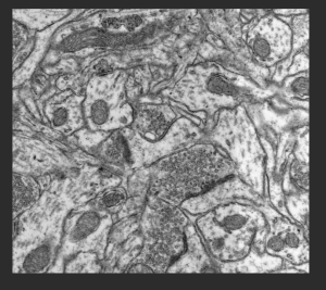
This example EM image is 13184 × 9808 pixels, so at 300 ppi, it is 43.947 × 32.693 inches. I know my final image size should be ~2 × 1.5 inches, but that can change depending on how images are arranged in the figure. So it would be great if we could crop the image to an approximate size, but also have some flexibility for finer adjustment later. Here's a way to crop an image without throwing away any pixels:
- Click Crop tool
 (keyboard shortcut = c). Now you should see your image surrounded by the crop handles.
 - If you know the aspect ratio of the final image, enter the numbers in the crop menu (next to "Ratio"). I'm keeping them blank for this example.
- Uncheck "Delete Cropped Pixels" in the crop menu.
- Click and drag any of the crop handles to adjust the crop area size.
- Click and drag the underlying image to adjust its position in the crop area.
- If you need to zoom in closer, hit Ctrl+"+". To zoom out, Ctrl+"-".
- If you want to start over, hit Esc. The crop handles will go back to edges of the image.
- When ready to crop, right click in the crop area and choose "Crop".
- Save the image (Ctrl+S).
- If you (or your PI) changed your mind and want to make a different crop, simply go back to the crop tool, and clock on the image. The crop handles and the entire pre-crop image will re-appear.
| Crop handle | Crop menu |
|---|---|
|
|

| Ready to crop... | Cropped! |
|---|---|
|
|

Adjusting brightness and contrast
Notes on histogram
Go to "Image" > "Adjustments" > "Levels" to bring up histogram for your image. A histogram shows the distribution of intensity values for all pixels in a image. For an 8-bit grayscale image, each pixel has a value between 0 (black) and 255 (white). For an 8-bit RGB color image, each pixel has the same range of values for each of red, green and blue channels. So the histogram will show how many pixels in your image have a given intensity value. It is a useful tool when assessing tonal range of your image. Here are some example images and their histograms:
| contrast too low | contrast too high | too dark | too light | just about right | |
|---|---|---|---|---|---|
| image | |||||
| histogram | |||||
| notes |
One thing to remember is that there is no such thing as "ideal" or "correct" shape of the histogram. If your EM image shows a lot of myelinated axons, this would result in a lot of dark/black pixels. conversely, if you have a lot of astroglial processes with light cytoplasm, you'll end up with a lot of light/white pixels. If your image is too bright overall, objects in lighter grays will be washed out. If your image is too dark, then a lot of fine details will be buried in dark grays. The goal here is to achieve an overall (as opposed to local) range of gray tones that allows the viewer to discern all the details in your image.
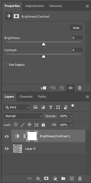
Adjusting brightness and contrast using an adjustment layer
Here we will talk about how to use adjustment layers to optimize overall brightness and contrast of your image. Avoid making these adjustments locally (i.e., applied only to part of the image) to enhance specific features in your image – this is considered as inappropriate manipulation. If you need to point to those specific features, use annotations instead.
- Make a new adjustment layer by clicking
 (look in the lower right corner) and choosing "Brightness/Contrast". Now you should see a new layer under the "Layers" tab and adjustment sliders for brightness and contrast under "Properties" tab.
 - Use the sliders to adjust brightness and contrast of the image.
- You can check the image before and after adjustment by toggling
 next to the brightness/contrast adjustment layer.
 - Save your work (Ctrl+S).
| "Layers" and "Properties" tabs |
|---|
|
Proof your image
Your original image file may not have been acquired in sRGB, so we need to check how it looks when it is brought into the sRGB space.
- Go to "View" > "Proof Setup" > "Internet Standard RGB (sRGB)"
- Go to "View" > "Proof Colors" (Ctrl+Y) → This will let you simulate what your image looks like in sRGB.
- Check how your image look. The image may appear a bit darker. Adjust brightness and/or contrast as described above, if necessary.
Export the final image
- Go to "File" > "Export" > "Export As..." (Alt+Shift+Ctrl+W)
- In the "Export As" window:
- Choose "PNG" under "Format".
- If your original image was 16-bit, check "Smaller File (8-bit)".
- Make sure "Scale" is set to 100%.
- Under "Color Space", check "Convert to sRGB".
- Click "Export".
- Enter a new file name and folder location of your choice.
- Click "Save".
- Inspect the exported image file.
| "Export As" window |
|---|
|

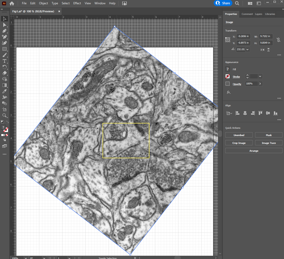
Putting together a figure using Adobe Illustrator
Setting up a new file
- Go to "File" > "New"
- In the "New Document" window, enter the following:
- Title (default is "Untitled-1")
- Width and Height: If you don't know the final size, leave it as the Letter size - 8.5 × 11 inches
- Color Mode: "RGB color"
- Raster Effects: "High (300 ppi)"
- Save file (Ctrl+S) to the folder of your choice. In the "Illustrator Options" window, keep defaults and click "OK".
| "New Document" window |
|---|
|

User interface
A couple of things MK finds useful:
- Rulers: "View" > "Rulers" > "Show Rulers" (Ctrl+R). You can change the unit of the rulers by right clicking on a ruler.
- Grids: "View" > "Show Grid" (Ctrl+"). If your rulers are in inches but the grid is not, you can change the grid here: "Edit" > "Preferences" > "Guides & Grid". Set "Gridline every:" to 1 in and "Subdivisions:" to 8.
- If you need to zoom in closer, hit Ctrl+"+". To zoom out, Ctrl+"-". (This is the same as in Photoshop)
- To pan around the image, use Hand tool
 – shortcut "H", or if you are in the middle of using another tool, hold the space bar to temporarily activate the hand tool.
Organize your images into layers
The layers feature in Illustrator is just that – all graphic elements are placed into a file as layers. What you see on your monitor is a top-down projection of all layers within a given file.
Locate the layers tab in the upper right corner. If your Illustrator doesn't look like the example, click ![]() and choose "Essentials". The layers tab shows what elements are located where in the strata of images. When you start a new file (as in this example), you would see just one layer called "Layer 1".
and choose "Essentials". The layers tab shows what elements are located where in the strata of images. When you start a new file (as in this example), you would see just one layer called "Layer 1".
Your figures will likely have multiple images and graphs. In general, use one layer for each panel of a figure to make your work easier. If a panel has a lot of elements, (e.g., complex drawings and graphs), you might also create layers (or sublayers) for each of those elements or group of elements.
In the layers tab, a layer that is highlighted in blue is currently active. You can just click on a layer of your choice to activate it. When you place or paste an image, it will be inserted to top of the active layer.
Each layer can be made visible/invisible by toggling ![]() and locked/unlocked by toggling
and locked/unlocked by toggling ![]() . If you don't see the lock icon, it can be turned on by clicking the empty space to the right of
. If you don't see the lock icon, it can be turned on by clicking the empty space to the right of ![]() . By default, all layers are unlocked. If a layer is invisible or locked, you cannot interact with that layer. So this is a good way to keep yourself from accidentally deleting a graph in Panel B, while you annotate that EM image in Panel A.
. By default, all layers are unlocked. If a layer is invisible or locked, you cannot interact with that layer. So this is a good way to keep yourself from accidentally deleting a graph in Panel B, while you annotate that EM image in Panel A.
While in the Layers tab, access layers options by clicking the icon with three horizontal lines ![]() . For example:
. For example:
- To rename a layer, click
 next to the layer tab and choose "Options for "Layer X"...". Enter a new name in the "Layer Options window and click "OK".
 - To add a layer, click next to the layer tab and choose "New Layer...". Enter name for the new layer and click "OK".
| "Layers" tab | "Layer Options" window |
|---|---|
|
|


Placing halftone (raster) images
Place, not paste.
Make sure your halftone images are already set to 300 ppi. If you are placing line drawing images in raster format, they need to be at 1200 ppi.
- Go to "File" > "Place..." (Shift+Ctrl+P)
- Navigate to your folder and choose images (PNG exports from Photoshop) to be placed on the AI file. You can choose multiple images in the folder by holding Ctrl.
- Click "Place".
- Click onto the artboard to place the image(s). Note that your image might appear much larger than the final size.
- Pick the Selection tool
 (shortcut "V"), then click and drag the image(s) to the desired location.
 - Save (Ctrl+S).
At this point, the placed image is not embedded into the AI file – it's only linked from the original folder location. This is indicated by diagonal lines across the placed image that is currently selected. So if the image does not look the way you wanted (e.g., looks a bit darker), you can go back to Photoshop to edit the image as described above and export it using the same file name. When this is done, Illustrator will detect the change and ask you if you want to update the linked image.
If you are ok with the way the images look, embed them. When you do this, those diagonal lines across the placed image goes away. If you move or delete the original image before it is embedded in your AI file, link for that image will be broken and Illustrator will tell you that it is missing.
To embed a placed image,
- Select the image using the Selection tool.
- Go to "Properties" tab
 .
. - Under "Quick Actions", click "Embed".
You also see other options under Quick Actions. For example...
- "Edit in Photoshop" will open this image in Photoshop to edit if you want to adjust brightness further. The changes saved in Photoshop will be reflected here in Illustrator automatically. However, if the placed image is a PNG export of a master file in PSD format, you might want to edit the master file and make a new PNG export using the same file name and location. As long as the file link is maintained, the new export will be reflected in the AI file.
- "Crop Image" will let you crop the placed image, but Illustrator will throw away pixels, so you will not be able to go back and re-crop to a larger framing later. So this should be done when you are ready to submit. For now, we will use clipping masks instead of cropping, as explained below.
After embedding, options available under Quick Actions change as well.
- "Unembed" will create a new file from the selected image into a folder location of your choice. You might choose to do this if you need to edit the image and don't have access to the master file.
| Quick Actions before embedding | Quick Actions after embedding |
|---|---|
|
|


Editing raster images
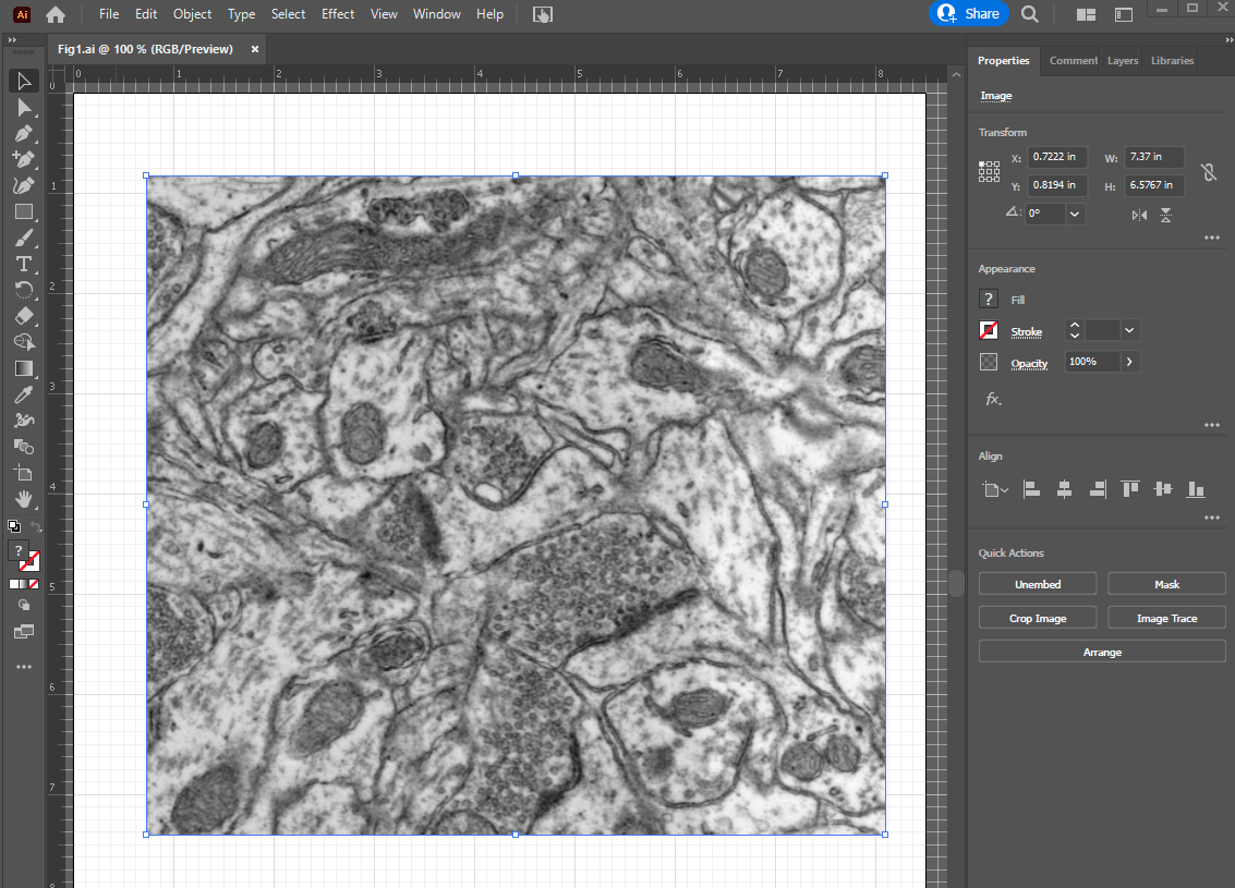
In this example, I have embedded a placed PNG image that was exported from Photoshop (see above).
As you can see, this image is too big – I want to crop to that spine in center of the image and fit it into ~2 × 1.5 inches. Also, I want PSD of the spine to be on the right side. So what I need to do is, (1) flip the image around vertical axis, (2) define the final image size (2 × 1.5 inches), (3) rotate the image to fit the spine with its presynaptic partners, (4) scale the image (if necessary), and (5) crop the image with a clipping mask.
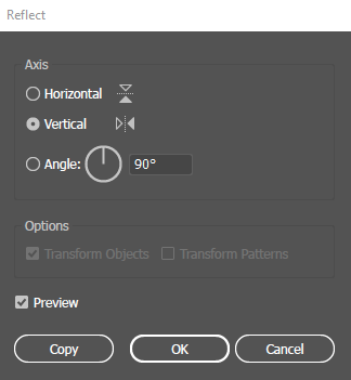
To flip the image horizontally,
- With the Selection tool, choose the image, and right click > "Transform" > "Reflect".
- In the "Reflect" window, choose "Vertical" and check/uncheck "Preview" to check that the image is transformed as intended.
- Click "OK".
| "Reflect" window |
|---|
|
To define the final image size,
- "Rectangle" tool (shortcut "M") – you might not see the rectangle tool in your tools bar because any one of the nested tools is appearing (see the image below). just click and hold on the nested tool and choose rectangle from the list.
- Once the rectangle tool is selected, click anywhere on the EM image. Define the size in the Rectangle window. Click "OK".
- At this point, your rectangle may not have any color – under Properties tab > Appearance, click on the box to the left of "Stroke" to bring up color swatches and pick a color.
- Move the rectangle to the desired location with Selection tool. You can also nudge it with arrow keys. You can change the increment by which each key stroke move the selected object: Edit > Preferences > General > Keyboard Increment.
| Tools nested with the Rectangle Tool | "Rectangle" window | "Properties" tab | Color Swatches |
|---|---|---|---|
|
|
|
|


To rotate the image,
- Select the image using the Selection tool.
- Move cursor to a corner of the image where the cursor changes to double arrowheads.
- Left click and drag to rotate the image.
- If you know by how many degrees to turn, then Right click > Transform > Rotate
Now my image looks like this:
Just by eyeballing, if I scale it down by 75% or so, the central spine and two boutons synapsing onto it should fit inside the yellow box.
To scale the image,
- Select the image using the Selection tool.
- Right click > Transform >Scale
- In the Scale window, enter the scale factor (in %) under "Uniform". Check/uncheck "Preview" to see if you need further adjustment. When it looks good, clock "OK".
- Make sure to remember this scale factor. You can annotate this on the image: pick the Type tool
 (shortcut "T"), click anywhere on the text, then start typing (e.g., scaled to 75%).
| "Scale" window | After scaling to 75%... It fits! |
|---|---|
|
|


Now that the image is scaled to fit the final size, let's crop the image.
It is possible to crop an image in Illustrator like in Photoshop, but Illustrator does not have an option of retaining all pixels. At this point, I don't want to throw away cropped pixels because my co-authors might insist on re-cropping the image later. So we'll use clipping mask to simulate cropping at this time.
To crop the image using clipping mask:
- Select the rectangle that was used to define the final size of this image.
- Under Properties tab > Appearance, clear color of the stroke by choosing
 ("None") in the color swatches.
 - Hold Ctrl and click on the image to select both the rectangle and the image.
- Right Click > Make Clipping Mask
| After making clipping mask... |
|---|
|

Annotations
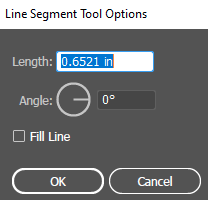
How to make a scale bar
The length of a scale bar, B (in inches) is calculated by the following equation:
 , where:
L: Length to be indicated on the scale bar (in nm)
S: Pixel size of the image (in nm/pixel)
R: Resolution of the image (in pixel/inch)
F: Scale factor of the image (fractions)
In this example, we want a 500 nm scale bar for the image with the pixel size of 1.91692276 nm/pixel at 300 pixel/inch resolution that was scaled down by 0.75. So this scale bar will be 0.6521 inches long.
- Pick the Line Segment tool
 (shortcut "/"; nested under rectangle, etc.) and click anywhere on the image.
 - In the Line Segment Tool Options window, enter the calculated length of the scale bar, set Angle to 0, and click "OK".
- Under Properties tab > Appearance, change the line color to black in the color swatches. Increase the stroke to 3 pt.
- If the image is mostly light shades of gray (as might be in a brightfield microscope image), then this black line will be sufficiently visible.
- If the image has a black background (as in a fluorescence microscope image, then change the color to white.
- If the image is grayscale with various tones (as in this example), then it would be a good idea to have this black line on top of a thicker white line. To do this,
- Select the black scale bar you just made.
- You might find it easier to zoom in to fill the window with the image (Ctrl+"+").
- Copy the scale bar (Ctrl+C), and paste it (Ctrl+V).
- Change the color and thickness of the pasted scale bar (white and 5 pt).
- Under the Layers tab, you should see the white line at the top of the layers, with a blue square indicating that it is selected. Under the white line is the black line. Click and drag the white line to beneath the black line. Now you should see the balck line on top of the white.
- If you have both lines against the white background, move them on top of the EM image, so that you can see them both better. It might be a good idea to lock the EM image before you do this.
- Select both lines (hold Shift and click), go to Properties tab > Align > click
 and
and  . Now the two lines should be perfectly aligned.
 - With both lines still selected, Right click > Group to keep them in the same group.
- Move the grouped line to the location of choice.
- If you choose to show length of the scale bar (i.e., "500 nm"), then:
- Pick the Type tool.
- Click on the image near the scale bar. A type tool with "Lorem ipsum..." will appear. At this point, you can set the font and size, as well as paragraph alignment under Properties tab > Character and Paragraph. (MK uses Arial Bold at 7 pt with the paragraph centered.)
- Type "500 nm", then hit Esc to exit the type tool.
- Click and drag the "500 nm" to line up with the scale bar. You'll see a magenta line when the center of the letters and lines are aligned. Release the "500 nm" when it reached the desired location.
- Now the letters are all in black, so it might not show against the grayscale image. With the letters selected, under Properties tab > Appearance, change color of the Stroke to white with the thickness at 0.1-0.2 pt. To check how well the white outline shows, you might want to make a test print (Ctrl+P).
- You might choose to group the letters with the lines at this point.
| Line Segment Tool Options window | before moving the white line | after moving the white line | two lines aligned perfectly |
|---|---|---|---|
|
|
|
|
| Type tool | letters aligned with lines | letters with 0.2 pt white outline | |
|
|
|


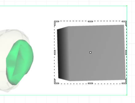
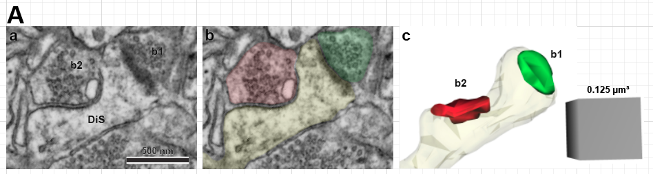
Matching a 3D scene image with the associated EM image
Now we will place a new panel with an image from 3D scene generated in Reconstruct for this spine.
- Create a new layer.
- Place the 3D scene image into the new layer.
- Pick the Line Segment tool, draw a line along a side of scale cube. In this example, each edge of scale cube is set to 500 nm.
- Under Properties tab > Transform, change the angle to 0.
- Now make note of the width (in this example, it is "W: 2.0626 in"). Use this number to calculate scale factor against the scale bar on the EM image, which is 0.6521 inches long. So the scale factor is 0.3162.
- Select the 3D scene image > Right click > Transform > Scale. Enter 31.62% under "Uniform" and Click "OK".
- You can now delete the line used to measure the scale cube. (Select the line, then hit "Delete" key).
- If you don't need to edit the 3D scene image further in Photoshop, then you can embed it.
| before scaling – that's too big! | a line drawn along the right side of the scale cube | Properties tab > Transform |
|---|---|---|
|
|
|
| after scaling – now that looks right. | ||
|


Looking at the images , I want to rotate the 3D scene to match the EM, but keep the scale cube as is. So we'll separate the two and rotate just the 3D spine image.
- Select the 3D scene image. Copy and paste it.
- Under Properties tab > Quick Actions, choose "Crop Image".
- Adjust the crop box to the scale cube. Click "Apply".
- Repeat cropping for the 3D spine on another image.
- Select the 3D spine image and move it over the EM image.
- Under Properties tab > Appearance, change the "Opacity" to ~50%. Now the 3D spine image should be transparent.
- Rotate and move the 3D spine image to match the underlying EM image. When done, bring opacity back to 100%.
- Now the rotated image is sticking out of the EM. You could set up another rectangle to make a clipping mask for the 3D spine, as we have done previously. Alternatively, if you know you don't need to go back to re-adjust the image orientation, you could crop the image at this point. To crop...
- From Quick Actions, click Crop Image.
- Specify the height of the crop box to match the EM image (1.5 inches in this example).
- Click and drag the left side of the crop box until it is aligned with the left edge of the EM image. The magenta smart guide will tell you when you are intersecting with a nearby edge.
- Click "Apply".
| crop for scale cube | crop for 3D spine | reducing opacity to 50% | rotate and move the 3D spine |
|---|---|---|---|
|
|
|
|
| crop the 3D spine to match the EM | done | ||
|
| ||


Drawing shapes with curvature tool
You know, I think it would be nice to have a duplicate of the EM image with color shading to indicate the spine, excitatory bouton and inhibitory bouton. We can easily draw complex curves with the Curvature or Pen tool in Illustrator.
Before we jump into drawing, I think I should describe how Illustrator handles lines. Each line is composed of anchor points and path. Anchor points are points that define path of the line. If a line is just a straight line, you'd have two anchor points, one at each end of the line. If you have a line that turns once along the way, you have three anchor points, one at the corner and two at ends. If you have a complex curved line, then you have multiple anchor points (in addition to two at ends), and those points may have handles to define the local curvature of the path. So an anchor point can be with or without handles depending if the line is curved or straight.
Here in this example, we'll use the Curvature tool to lay down paths along structures of interest, and then change some of the anchor points to make part of the contour straight:
- Create a new layer.
- Copy the EM image (this image should have already been embedded) and paste it into the new layer. Lock this image (but not the entire new layer).
- Pick the Curvature tool
 (shortcut Shift+~).
 - Click along the contour of the structure of interest until it is completed.
- Where the curvature intersects an edge of the image, hold Alt key and click on the edge when the magenta smart guide says "path". Holding the Alt key changes the anchor point type to make the subsequent line straight. If you forget to do this, you can change the anchor point after you completed the closed curvature by doing the following.
- After the curvature is completed, pick the Anchor Point tool
 (shortcut Shift+C; nested with Pen tool).
 - Click once on each of the anchor points along edge of the image – this will remove handles from the anchor points and make the curvature into straight lines.
- After the curvature is completed, pick the Anchor Point tool
- Now, under Properties tab > Appearance, change color for "Fill". You can pick a color from the color swatches or specify a color in Color Mixer. For the spine, we'll pick RGB yellow (#ffff00, or Red = 255, Green = 255, Blue = 0). Adjust Opacity to 10%. No color for Stroke.
- Repeat for other structures of interest that you want to point to.
| curvature tool for tracing | completed curvature with straight lines along the edges | if your curvature looks like this, change anchor points to make straight lines |
|---|---|---|
|
|
|
| picking a fill color with color mixer... | this spine is finished | done |
|
|
|


Adding lines and arrows
At this point our example figure looks like this:

It's looking nice, right? Now we'll finish annotating these panels using lines, arrows and letters.
Below I went ahead and used the Type tool to annotate the images. The capital "A" is 18 pt, all other letters are 7 or 8 pt.
To insert special characters ("µ" in this example):
- Open Character Map in Windows.
- Select and copy the character you want to use.
- Paste it in Illustrator.
(MK keeps a .txt file listing frequently used special characters. See below.)
| Character Map in Windows | MK's characters.txt |
|---|---|
|
|


To make superscript or subscript (0.125 µm3 in this example):
- Type in the letters normally.
- Highlight the letter you want to change. You'll see options appear.
- Click on the option you want.
| superscript or subscript |
|---|
|

We'll also add arrows/arrowheads to point to synapses in Panels Aa and Ac.
- Lock the underlying image.
- Pick the Line Segment tool (shortcut "/"; nested under rectangle, etc.).
- Click and drag a line where you want to.
- Under the Properties tab > Appearance, change color to black (or a color of your choice) for Stroke.
- Still under the Properties tab > Appearance, click on "Stroke" to bring out options.
- Under "Arrowheads", choose an arrowhead from the drop down menu. There are two drop down menus – left one is for start of the line, and the right one for end.
- Your arrowhead might be too big – adjust the size "Scale". This number is expressed as % of the line thickness, so as you increase the points on "Stroke", the arrowhead will get proportionally bigger.
- You can also drag one of the anchor points to adjust the length. If you want to show only the arrowhead, then shorten the line until it is obscured by the arrowhead.
Tip: If you are pointing to similar objects (like synapses) within an image, it would look better if all arrows are in the same format. Create and optimize one, then copy it.
| Properties tab > Appearance, "Stroke" options | This arrowhead's too big! | change the size... | looks good |
|---|---|---|---|
|
|
|
|
| |||


Basic drawing
Curvature tool
Pen tool
Clipping mask is your friend (who can be annoying sometimes)
Placing vector images (e.g, graphs)
From Microsoft Excel – just copy and paste into layer of choice
From an EPS or another AI file – open in Illustrator; check how elements are grouped, if at all; may choose to edit before copy/paste
Editing vector images (e.g, graphs)
Release clipping masks for all elements
line thickness and font size may not be exactly the same as set in the graphing software – do you care? can be noticeable.
Text (e.g., axis labels) may be divided up in a strange way
Checking colors for colorblindness
Go to "View" > "Proof Setup" > "Color Blindness" – There are two options. Check both to see how your figure appears.
Can you differentiate different colors in your figure? You should be able to, if you have followed this.
Convert text to outlines
this will make all text into line drawings, so they can be displayed or printed correctly even when the font or special characters in your figure are not supported by a computer/printer
text cannot be edited after being converted into outlines
this should be done for the final version
should be saved as a new file so that you could come back to the original to edit text
But I want to use Microsoft PowerPoint to assemble my figures!
Yes, I hear you. You've used PowerPoint all your life and you know it like back of your hand. And yes, you can insert raster images and graphs from Excel as vector images. In fact, an Excel graph pasted into a PowerPoint file will automatically update when changes are made to the source spreadsheet (as long as the link is maintained), so this can be very convenient.
So, when you assemble your figures in PowerPoint, just like when using Adobe Illustrator, make sure that your raster images satisfy resolution requirements for your journal before inserting into PowerPoint.
There are things PowerPoint is not able to do, so you need to be aware of them:
- PowerPoint will not convert text into outlines. So If you have any special characters (like Greek letters and other non-English alphabets) in your figure, they may not be recognized by some computers and/or printers. If this happens with your journal's typesetter, then you really need to pay attention when proofing your paper before publication. This can be prevented if you copy and paste those special characters from Character Map in Windows. (MK keeps a .txt file listing frequently used special characters.)
- PowerPoint will not save as or export to an EPS file, so this would be an issue if your journal requires EPS format.
- PowerPoint will not proof your figures for colorblindness. Boo. (Just make sure to define your color palette beforehand.)
- There may be more things here, but MK is not aware of them as of this writing.